


Send and receive money from anywhere with BUILDIX ERP integrated payment options. Connect multiple payment gateways and track your money easily.

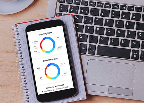
Get real-time analytics and advanced inventory management with serial , batch, bill of materials, multiple warehouses, stock transfers & adjustments and more.

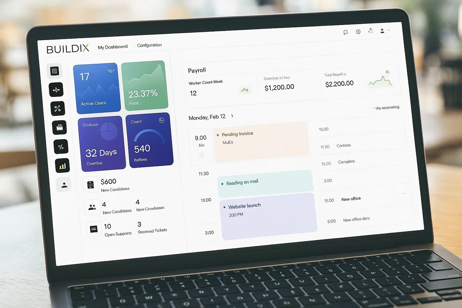
Generate and compile all your business data into a single report. Select which data points to include and how they should display.

Get 360 degree view and automate Sales Pipeline, Lead generation and after sales process all under one roof.

Create a self-service portal for employees and managers to manage payslips, loans, leaves, appraisals, leaves and claims/reimbursements.

Start selling online without writing a single line of code. Launch your website and online shop with BUILDIX No-Code website builder.